
Rooted in Timelessness: How We’re Interpreting AW25 Interior Trends

At Rebecca Winter Design, every space we create begins with the same belief: design should feel deeply personal, effortlessly elegant, and never disposable. Our clients come to us for spaces that feel like home - not just today, but for years to come.
So when seasonal trends begin to surface, we look closely. We’re not trend-led for the sake of it, but we are deeply inspired by the design world’s evolving language - especially when it echoes the values we’ve always held close: comfort, authenticity, and longevity
Here are the AW25 design directions we’re embracing
Soft Silhouettes & Organic Shapes
In a world that’s increasingly fast-paced, clients are yearning for interiors that feel calming and nurturing. Curved furniture, sculptural forms, and gentle shapes are a natural response.
We’ve long championed this language - choosing curved sofas, arched joinery details, or even a freeform dining table to soften a room’s flow and invite people to slow down. It’s not about being overly stylised—it’s about creating rooms that feel like they’re holding you.
In our Edenwood project, we designed and built bespoke arched shelving cabinetry to gently soften the architecture and create a visual rhythm throughout the space. These sculptural elements were thoughtfully paired with a gently curved dining table—bringing flow and cohesion to the open-plan layout. The result is a space that feels elegant and grounded, with each curve working quietly to enhance comfort and connection.


Colour Drenching & Double Drenching


There’s a boldness emerging in how colour is being used—not just as an accent, but as an immersive experience. “Colour drenching” means wrapping a space in one hue, while “double drenching” pushes further with complementary colours across walls, ceilings, trim, and even furniture.
While this might sound at odds with timelessness, it’s a beautiful opportunity to create mood and personality - when done thoughtfully. We work closely with our clients to find tones that speak to them deeply. Earthy pinks, sage greens, or rich blues used in a layered, tonal way can bring warmth and cohesion that feels anything but fleeting.
We’re currently weaving colour drenching into several upcoming design schemes, and our clients are loving the depth and atmosphere it brings. While the term might suggest bold hues, it can be equally powerful and timeless when applied with neutrals. In one of our latest concepts, we’ve layered warm off-whites across walls, woodwork, and soft furnishings to create a cocooning, seamless space that feels both refined and calming. By enveloping a room in a single tone, even a quiet one, you create an immersive environment that elevates everyday living.
Earth Tones & Warm Wood Finishes
We’ve never been ones to chase cool greys or hyper-minimalist palettes. AW25’s focus on grounding earth tones and natural textures is exactly where we feel most at home. These palettes don’t shout, they comfort. They connect us to nature and offer a sense of calm that doesn’t date.
Whether it's warm oak cabinetry, clay-toned walls, or rust and ochre textiles, we find these hues add emotional depth to a space. It’s this kind of gentle richness that allows a room to age gracefully, and our clients often tell us that these are the spaces they return to most.

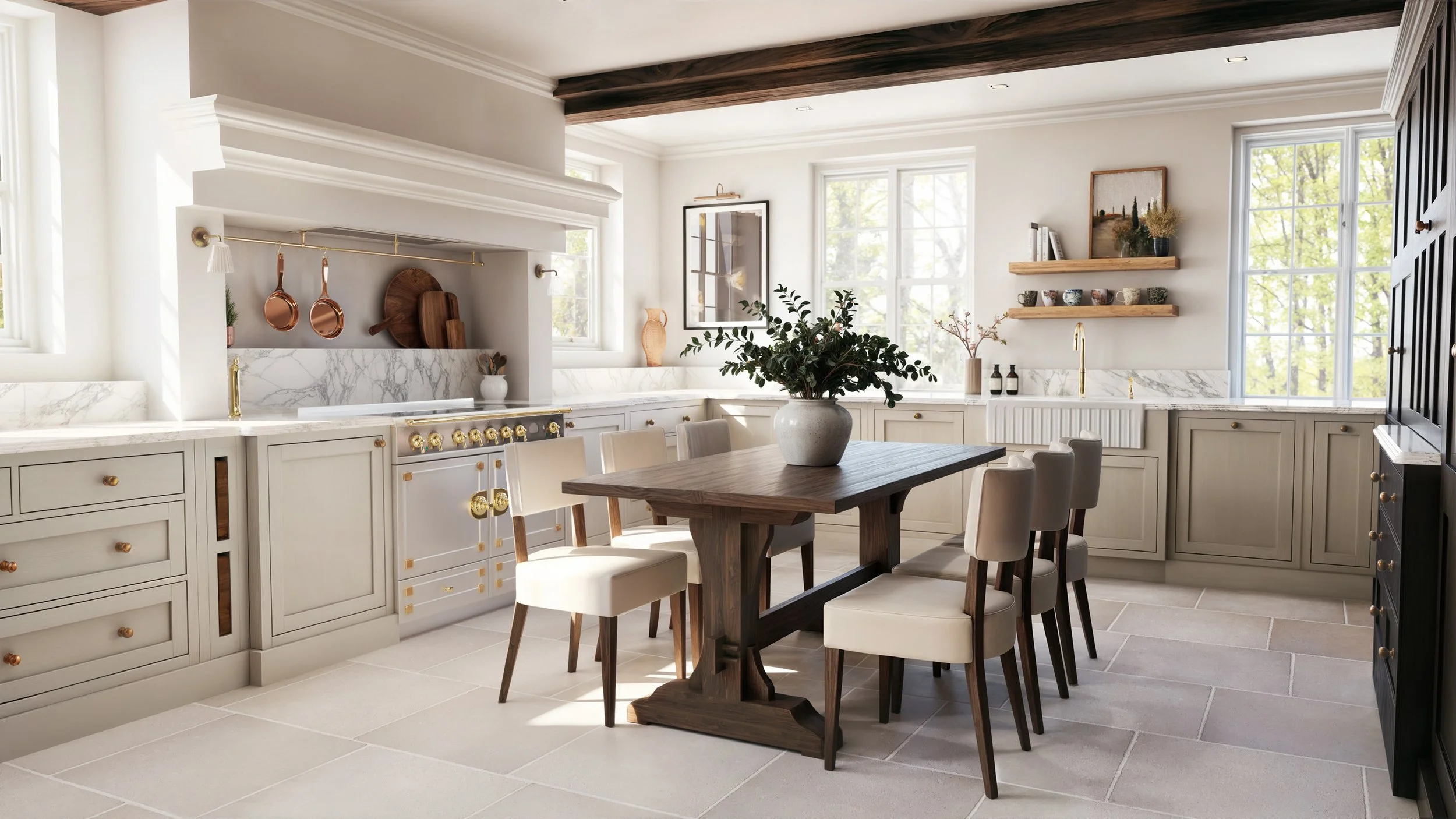
Our Watermill project is a perfect example of how earth tones and natural textures can bring depth and quiet luxury to a space. In the kitchen, we’ve layered limestone flooring with rich walnut cabinetry and honed marble worktops—each material chosen for its warmth, texture, and longevity. Off this central space, soft earthy greens and apricot tones flow into adjoining rooms, creating a subtle connection between spaces that feels natural and effortless. Every detail is rooted in a desire to ground the home in comfort and authenticity.
Statement Lighting
Lighting is never an afterthought for us. It’s one of the most powerful tools in shaping atmosphere and rhythm in a home. AW25 is leaning into lighting as sculpture, and we couldn’t be more excited.
Think: oversized pendants that anchor a dining space, floor lamps that double as art, or chandeliers with playful, organic forms. These aren’t trend pieces, they’re focal points, designed with care, chosen with intention, and placed with purpose.
In our Stockwell project, a full refurbishment of a listed Georgian property, we’ve layered in sculptural, structural lighting to bring a modern clarity to the building’s historic fabric. The architectural bones of the home are beautifully traditional, so we used lighting to honour and highlight those details while still expressing a contemporary edge. Oversized pendants, chandeliers and striking wall lights were chosen not just for function, but to create focal points that echo the rhythm of the architecture. It’s this balance of old and new, form and function, that brings depth and originality to the space


Final Thoughts
Timelessness isn’t stagnant. Trends can sometimes get a bad name, but we believe the best ones are just reflections of deeper shifts in how we want to live. At Rebecca Winter Design, we filter each idea through our lens of timelessness, client connection, and understated elegance. These AW25 directions? They feel like a continuation of everything we already love, made even more meaningful by the way they bring comfort, craftsmanship, and personality to the forefront.

We’d love to help you interpret them in a way that feels right for your home.